Branding designed for Sacca Punch Diet Isotonic Drink. The concept of this isotonic drink is that it represents urban sports lifestyle of youth 15-39 years old demographic target audience. Who loves marathon, obstacle challenges, high intensity workout and sports.
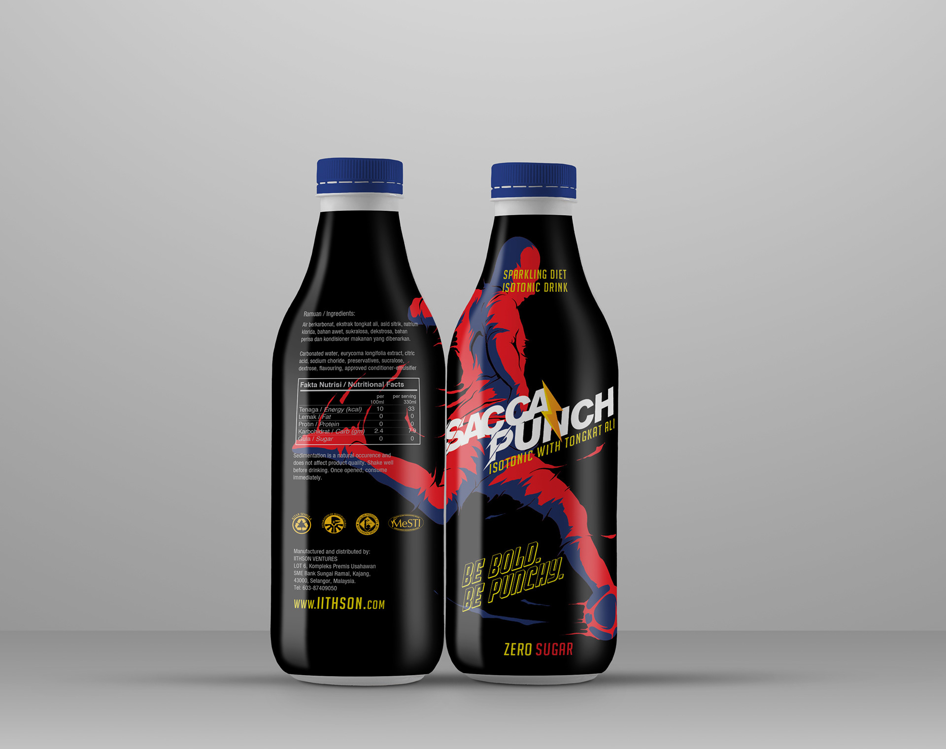
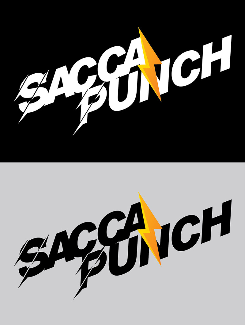
With Visual Option 1, we play with 3 primary colors, Red, Blue and Black and Yellow as supported element within the typeface logo.
In label design, we added silhouette athlete playing football with some liquid effect to show energetic movement in 2 colors red and blue as carried in client's tagline; Be Bold. Be Punchy.
The logo we play in bold structure typeface with lightening effect in yellow to give balance between to word typeface.
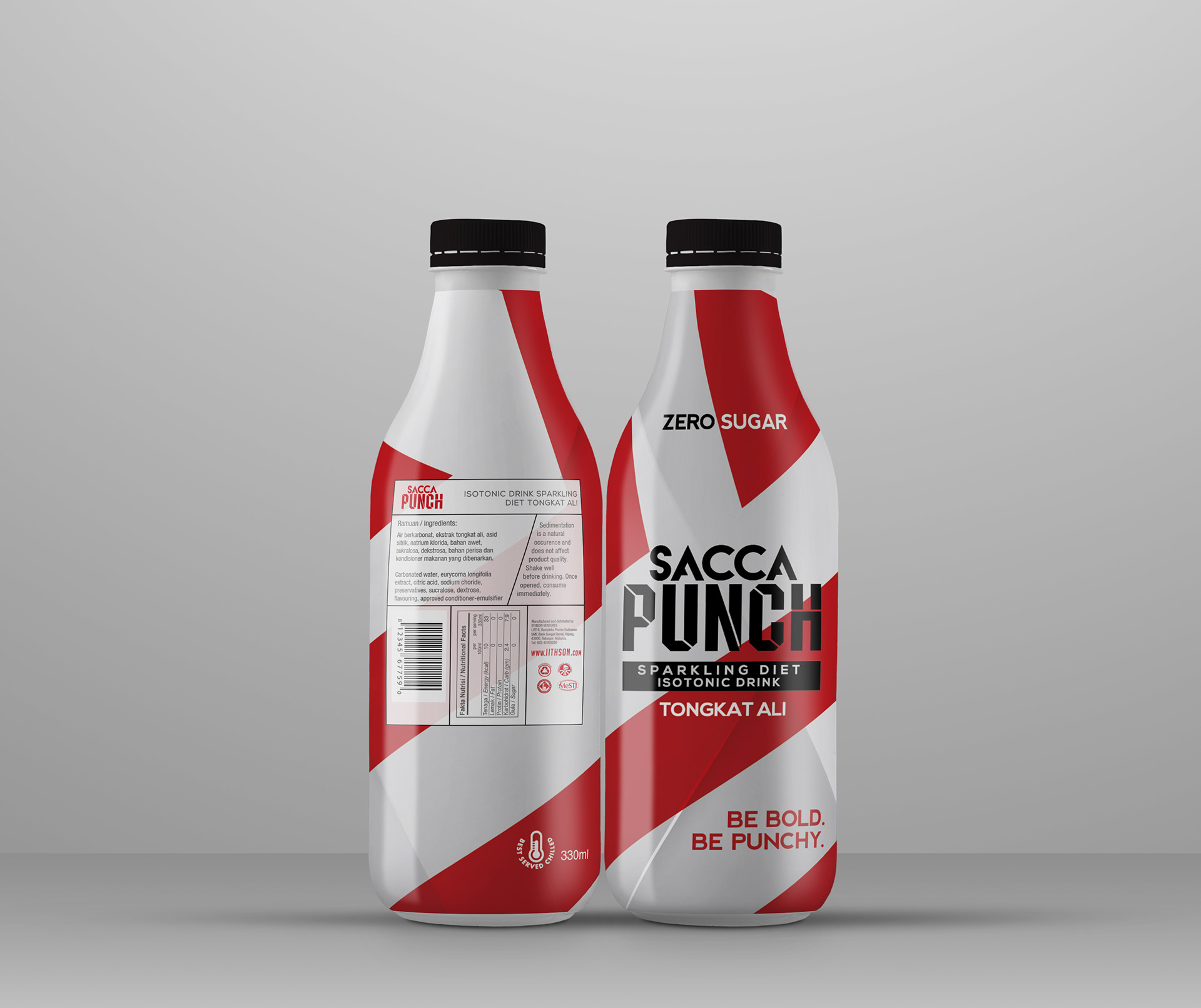
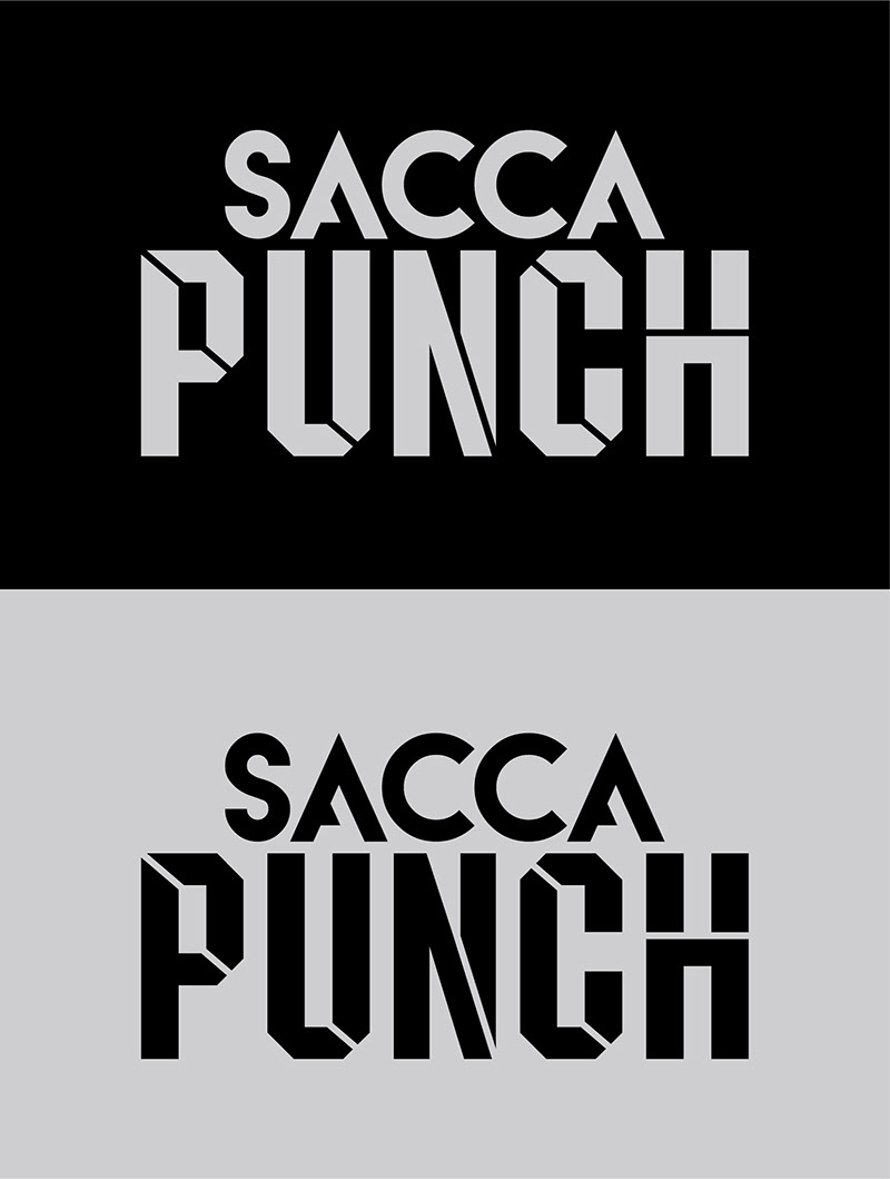
This is the second option we are working on. Playibg around with minimalist design and color. White and red on the background and product logo in black color.
The background, we design in red geographic pattern to make packaging visual design stand out.